Designing a restaurant discovery platform around how people with food allergies actually choose where to eat.

Lead Product Designer
EatSafe is an early-stage platform helping people with food allergies make safer dining decisions through transparent menu information and personalised recommendations. As Founding Product Designer, I led the product from discovery through to launch, combining behavioural research, analytics and iterative design to create experiences that reduced uncertainty and increased user confidence.
What was the problem?
Choosing a restaurant is usually framed as a question of taste.
For someone with a food allergy, it begins as a question of risk.
Most restaurant platforms are built to help people decide what looks good. Ratings, photos, cuisine and distance dominate the experience. But those signals are secondary when the cost of getting it wrong could be a serious allergic reaction.
EatSafe was created to make that decision less uncertain. The ambition was simple: help people feel more confident & safe in an experience that usually makes them feel like a burden.
The difficult part was that “safe” does not mean the same thing to everyone. Two people avoiding the same allergen may have completely different levels of sensitivity, comfort with cross-contamination and willingness to speak with staff. The product could not simply place a green tick beside a restaurant and pretend the answer was absolute.
It needed to help users make their own judgement, quickly and with enough context to trust it.
What we learned
To understand how people reduced anxiety before choosing a restaurant, I ran a series of one-on-one research sessions inspired by the behavioural work of Daniel Kahneman and Amos Tversky (the 🐐's of Behavioural Economics).
Rather than asking participants which features they wanted, I ran a series of realistic restaurant-selection tasks and observed how they made decisions. I asked them to sort and prioritise the information they relied on when judging whether a restaurant might work for them.
For example, this card sorting activity.
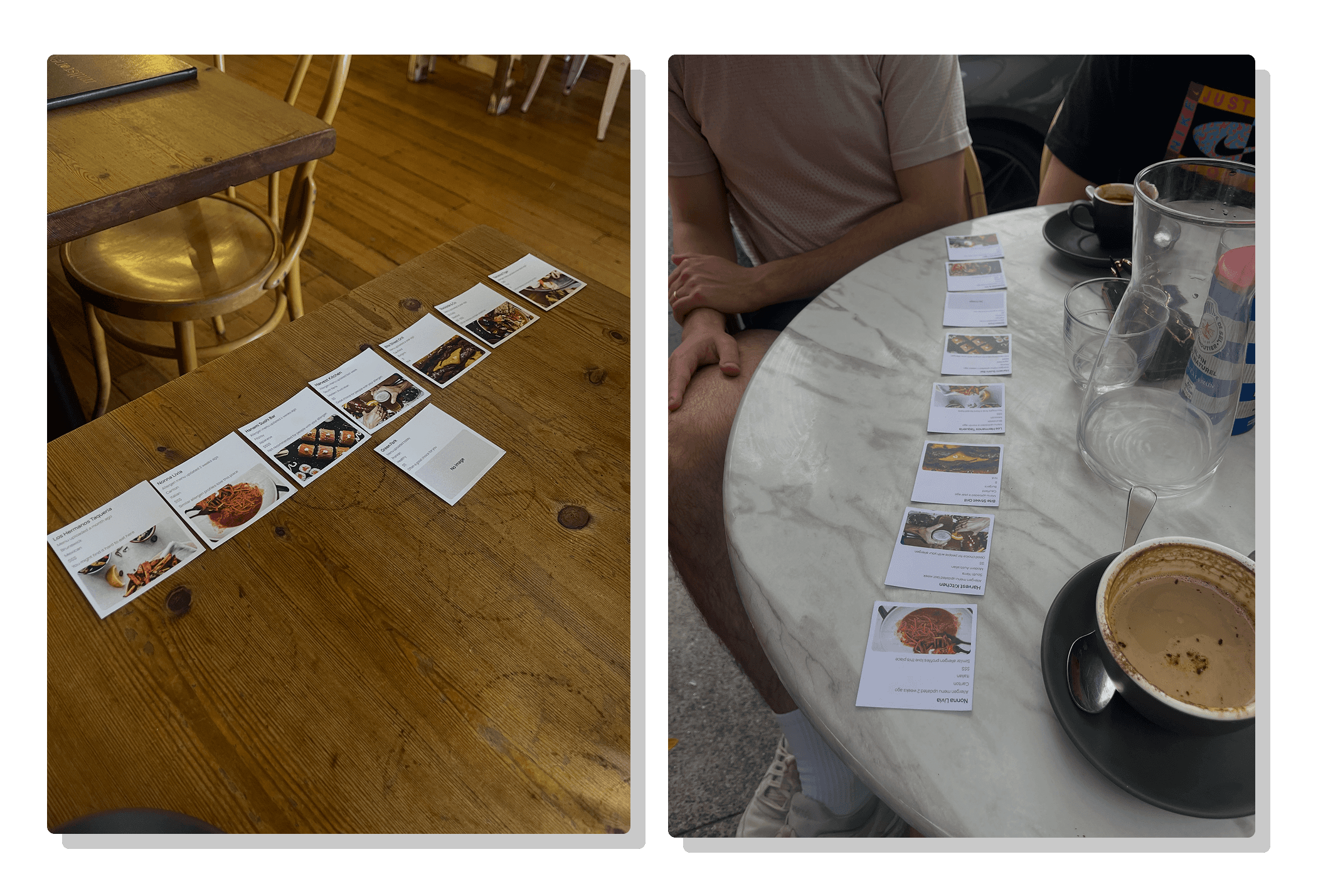
Cuisine repeatedly emerged as one of the first and most important signals.
Participants made broad statements such as:
“I know I can’t eat at Thai restaurants because they have peanuts in everything.”
“Mexican is normally okay for me.”
“Italian is basically off the table if you can’t have gluten.”
The exact cuisines varied by allergen, but the behaviour was consistent. People were using cuisine to quickly rule restaurants in or out before inspecting the actual menu.
At first, this looked like a preference.
Going deeper, it became clear that it was a shortcut (this aligned with the availability heuristic described by Kahneman and Tversky: people tend to judge likelihood using information that comes to mind most easily).
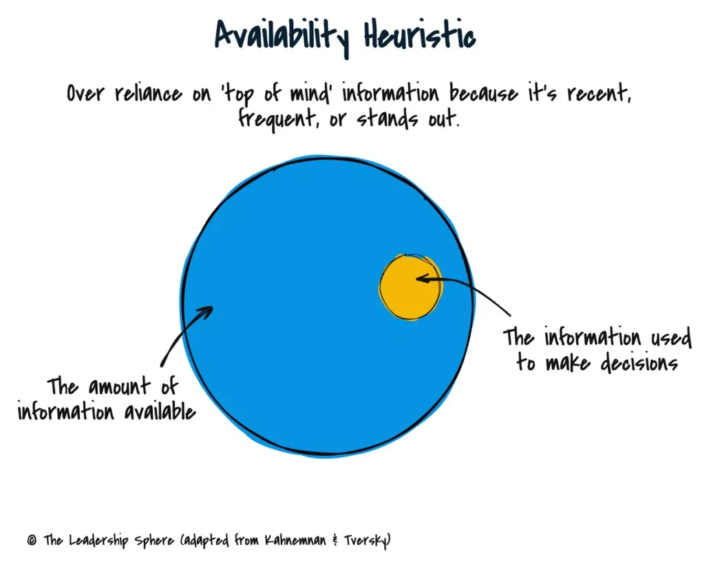
Users could easily recall previous experiences, familiar ingredients and well-known associations between particular cuisines and allergens. Those readily available examples shaped their judgement of new restaurants, even when the specific menu might tell a different story.
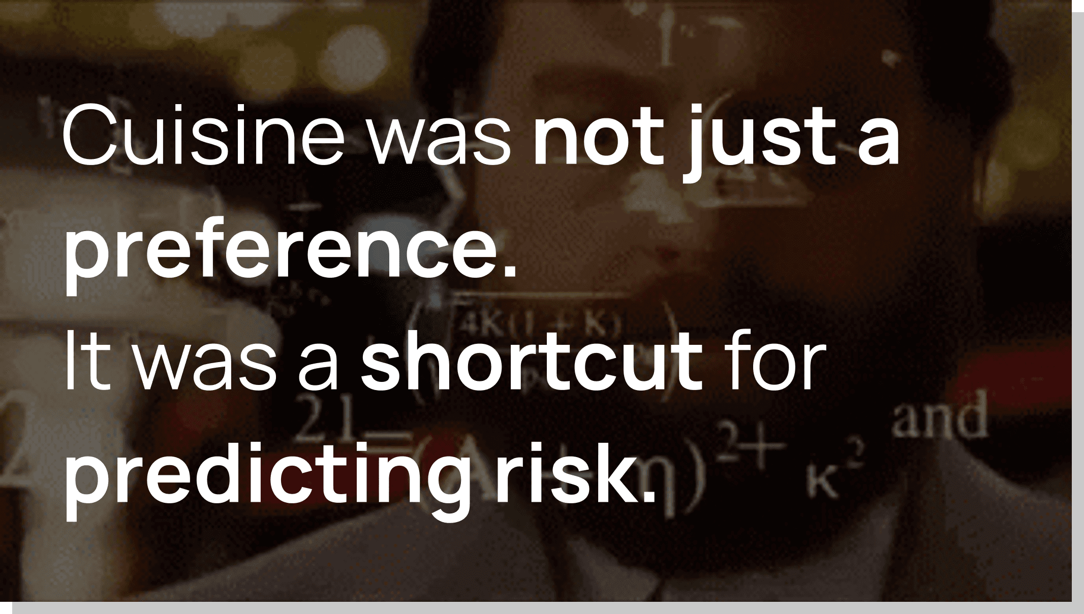
The shortcut helped users reduce anxiety and cognitive effort, but it also narrowed their options. A cuisine they assumed would be difficult might contain many suitable dishes, while a familiar fallback might offer very little.
That created the design opportunity.
Instead of asking users to infer allergen prevalence from cuisine, EatSafe could let them select their allergen and see, at a glance, what proportion of each restaurant’s menu might work for them.
High-quality imagery also proved to be an important trust signal. During the card sorting exercise, participants repeatedly favoured restaurants with professional photography, associating them with greater transparency and confidence before they had even opened the menu.
What we did
We turned suitability into a scannable match score
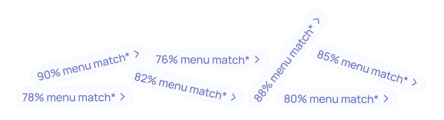
I designed the match score to answer a practical question quickly: “How much of this menu is likely to work for me?”
A user would need to filter for their specific allergen upon browsing in order to see the menu match pill.
The percentage was based on the number of menu items without the user’s selected allergen compared with the total number of analysed menu items.
For example, a 75% match meant that 30 of 40 analysed dishes did not contain the selected allergen.
The score was designed to support comparison, not provide a guarantee of safety. It sat alongside clear explanations and reminders to confirm preparation and cross-contamination directly with the restaurant.
We made the score useful across cuisines
The match score allowed users to compare restaurants they may never have considered together.
Instead of beginning with “Which cuisine is usually safest for me?”, users could begin with “Which restaurants actually give me the most options?”
This widened discovery. A user might find that a cuisine they usually avoided had a strong match, while a familiar fallback offered surprisingly little choice.
The score did not remove cuisine from the experience. It put cuisine in the right place: as a preference considered after relevance, rather than a rough substitute for allergen information.

We designed for combinations, not just individual allergens
Most allergy content online is organised around one allergen at a time.
That approach breaks down for the people experiencing the greatest friction: users with multiple allergies, or families and groups trying to account for several needs at once.
We designed the filtering model so restaurants could be evaluated against a combination such as peanut and sesame, rather than requiring the user to search each allergen separately and manually reconcile the results.
This made the experience meaningfully more personal. It also created a clear distinction between EatSafe and static editorial lists.

We made multi-allergen filtering the sign-up moment
We did not want to place an arbitrary account wall in front of basic discovery.
Users could still explore restaurants and understand the value of the match score with a single allergen (the 'AHA' moment). But selecting multiple allergens unlocked a more personalised result and required an account.
This connected sign-up to a genuine increase in utility.
The user was not being asked to register simply to continue browsing. They were being asked to save the information required to calculate a result that generic restaurant lists could not provide.
The sign-up flow captured the user’s allergen profile, then returned them directly to the newly personalised restaurant results.
Below is from a real user, captured using our Product Analytics tool.
We kept the score transparent
Based on user feedback, it was noted that a simple percentage could look authoritative, particularly in a high-stakes product.
We therefore made the score explainable. Users could see what it represented, how many menu items had been analysed and why the restaurant was appearing in their results.
We avoided describing the score as a safety rating. It was a measure of menu compatibility based on available ingredient information, supported by clear language about uncertainty and the need to confirm with staff.
Below is from a real user, captured using our Product Analytics tool.
Our impact
Around 45% of all new accounts came through the multi-filter call to action, and 90% of users who reached that point completed sign up. New users also selected an average of 3.2 allergens, reinforcing what we had seen in our research: many people weren't managing a single allergy, but a combination of dietary requirements unique to them.
The match score also influenced how people explored restaurants. When a personalised score was shown, 89% of restaurant clicks were on restaurants with a 75% or higher match, while 61% were on restaurants with a perfect 100% match.

