Building a lean website to validate demand for plant-based memberships.
2024
UX Designer & Web Designer
Katie White, a plant-based chef and nutritionist, wanted to grow her online presence and explore the idea of offering exclusive paid content through a membership model. My task was to help her test this idea quickly and affordably without committing to a full build. We restructured her website's information architecture, clarified the user flow, redesigned the UI, and used a lightweight email sign-up approach to test audience interest before going any further.
Discover
Katie had built a passionate community through Instagram and word-of-mouth, but her website lacked structure and didn’t provide a clear pathway for users to engage with her content or her brand. She wasn’t sure what her audience would actually pay for.
We kicked off the project with user interviews focused on her existing followers and subscribers. These conversations helped us uncover what people valued most: recipe simplicity, personal storytelling, and guidance on transitioning to plant-based living. We created a lean persona that reflected the typical visitor: health-conscious, curious, time-poor, and craving consistency.
Define
We redefined the site’s goals around two things:
Increase clarity and engagement, so new visitors understood who Katie was and what she offered
Test willingness to pay, through a membership pre-signup mechanism
To support that, we needed to:
Restructure the site’s information architecture and navigation
Create a clear, focused value proposition for the membership
Ensure the new design system felt personal, calm, and approachable, just like Katie’s tone
We also planned a validation loop: before spending money on gated content, we’d capture intent via a Mailchimp landing page with a lightweight sign-up.
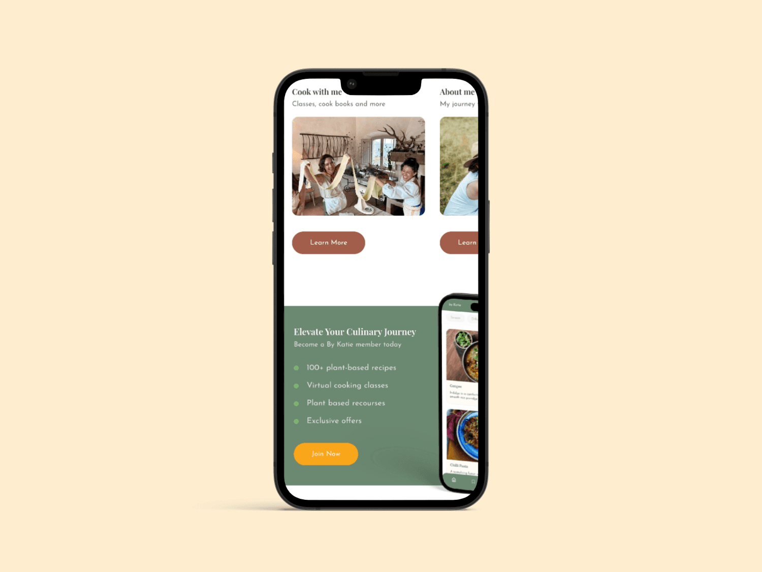
Design
I created a simple, modular design system rooted in whitespace, warmth, and subtle organic cues. We refined:
Page structure and flow (with key focus on the homepage, about, and recipes)
Membership call-to-action and placement
Mobile-first interactions for a predominantly Instagram-driven audience
The flow led users from brand introduction → content sampling → value proposition → sign-up, all without building gated content or membership tech upfront.
We tested early wireframes for tone and clarity, then moved into high-fidelity UI design optimised for Framer.
Deliver
The redesigned site provided Katie with a scalable foundation and a way to gauge real demand before investing further. Results included:
A validated membership interest list to inform future product development
A more confident brand presence aligned with Katie’s values and voice
This project demonstrated how lightweight UX strategy, good IA, and thoughtful design can move a business forward without overbuilding.


