Reducing support volume and improving clarity in The Good Guys help centre
2025
UX Designer
The Good Guys Help Centre had grown into a sprawling collection of help articles scattered across different pages and platforms. The experience lacked a consistent structure, had no clear categorisation, and didn't follow well-understood help UI patterns. Users found it overwhelming and difficult to navigate, which led to a spike in support requests and frustration. My task was to audit the experience, define a clearer structure, and redesign the Help Centre to reduce cognitive load and improve self-service outcomes.
Discover
The existing Help Centre suffered from a lack of information hierarchy and consistent design. Thousands of articles were published in different locations across the site, often using slightly different UI layouts or outdated components. Some articles were duplicated or buried under vague categories.
We saw a direct behavioural loop forming:
Users struggled to find answers
They gave up and searched for the Contact Us section
That section was also hard to use
Frustration led to a rise in email and phone requests, increasing pressure on support teams
We kicked off the project with a UX audit of the existing Help Centre, focusing on established design patterns for self-service portals, knowledge bases, and FAQs. We also looked at heatmaps, search logs, and user session replays to understand common drop-off points.
Define
To bring order to the chaos, we first focused on defining a clearer, more logical information architecture. We held stakeholder interviews and ran card sorting workshops with customer service staff and internal users to surface how people expected content to be grouped.
From there, we established a category model with intuitive naming, progressive disclosure, and support for cross-linking between related articles. We aligned our design with well-known support UX patterns used by leading retailers and software platforms by minimising novelty and prioritising clarity.
Our core design goals were:
Reduce cognitive load
Surface helpful content early
Minimise user effort in locating answers
Reduce unnecessary escalations to support
Design
We explored early concepts through low-fidelity wireframes, using them to test content placement, navigation structure, and link density. As we moved into high-fidelity design, we simplified the UI and removed unnecessary elements that distracted from the core task: helping users solve problems fast.
Key improvements included:
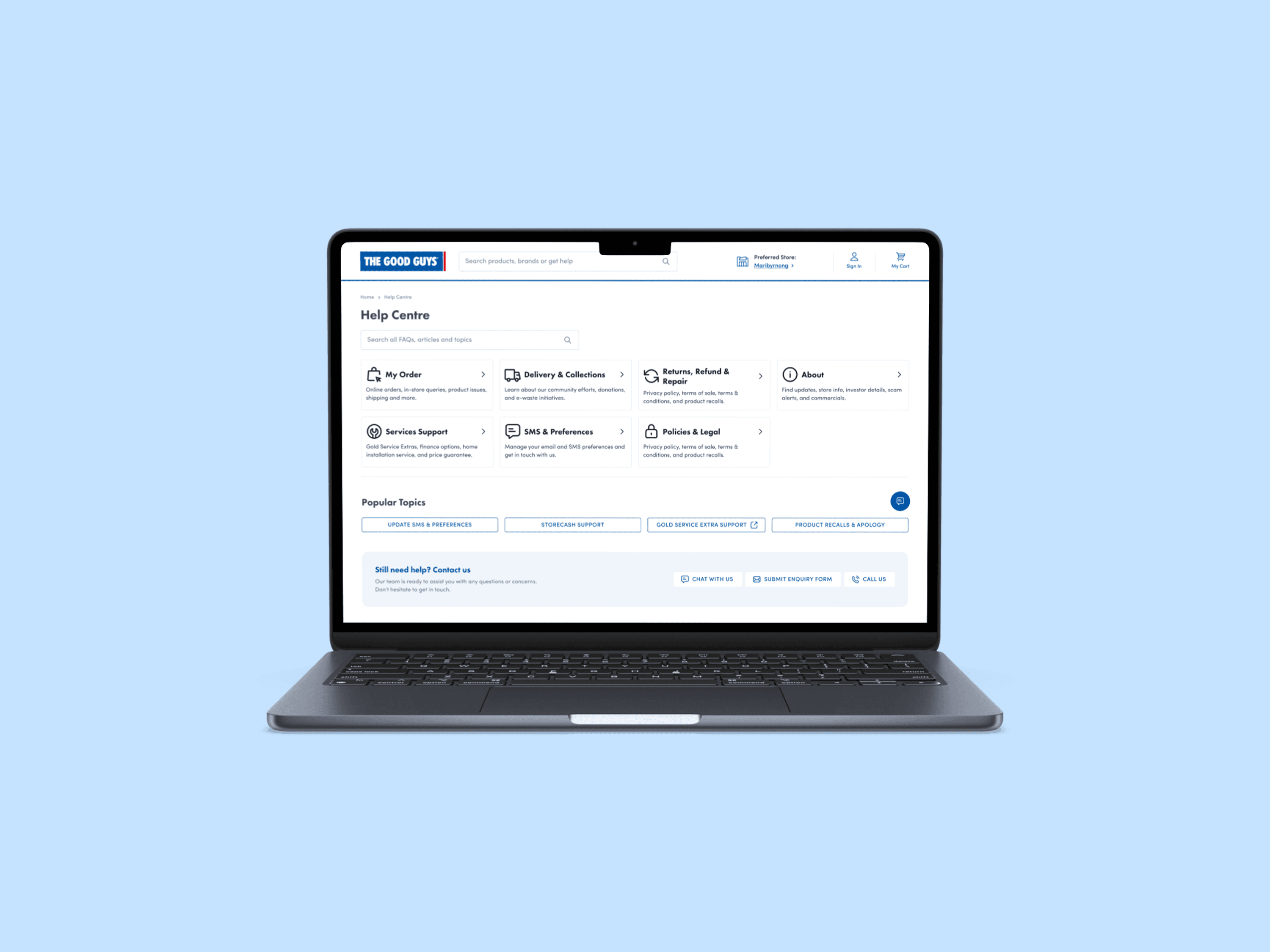
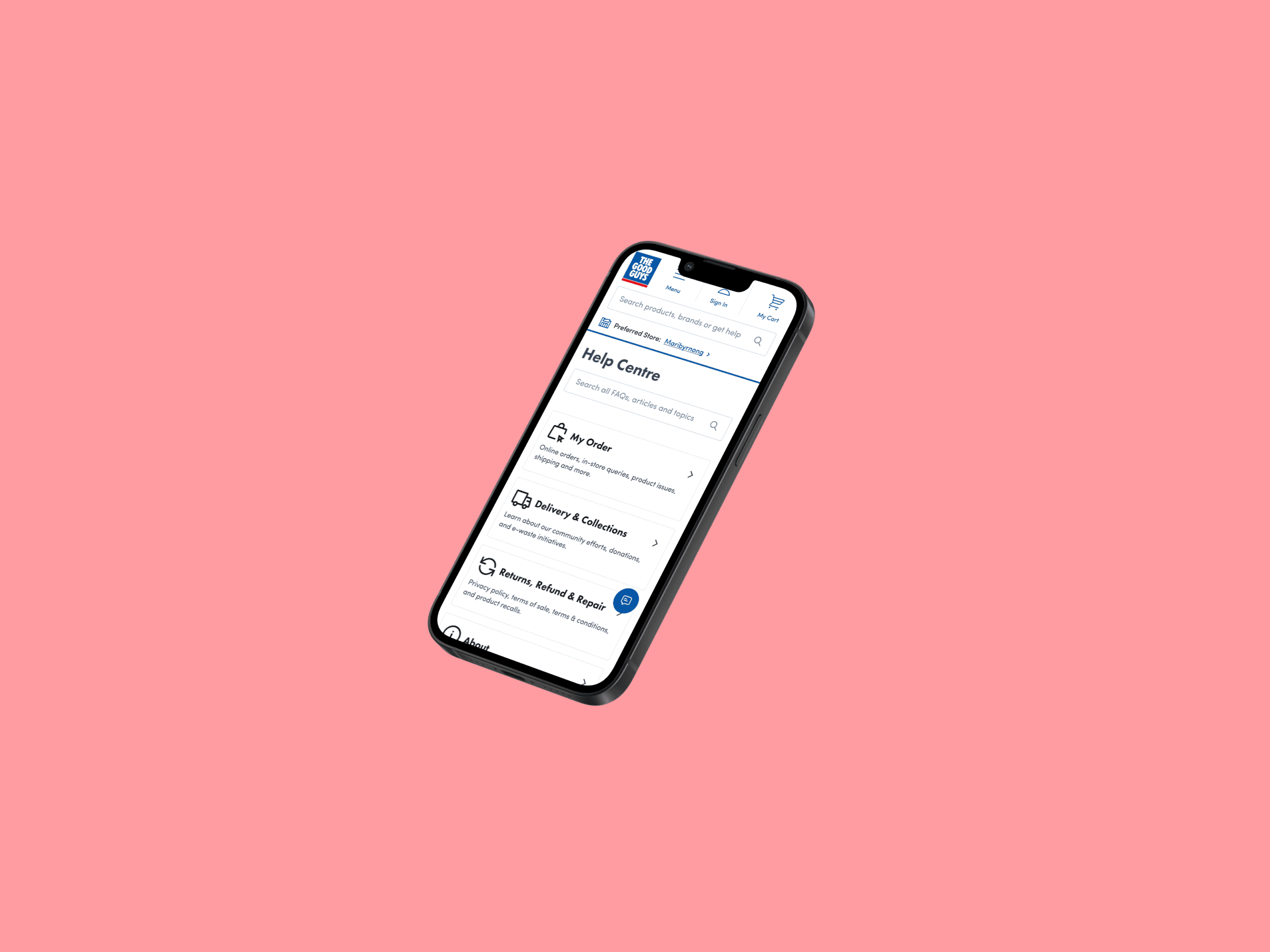
A consistent, scalable layout for all help articles
Clear categorisation with iconography and headlines
A prominent search experience with autosuggest
Inline links to contact support only after self-service attempts
Responsive design optimised for mobile users in problem-solving contexts
Every detail was designed with simplicity and helpfulness in mind and informed by the real-world support issues that were driving users to escalate.
Deliver
The redesigned Help Centre strives to make it significantly easier for users to find accurate, relevant help content without bouncing to other parts of the site. The experience aims to reduce friction, improve comprehension, and align the UI to better support people in moments of need.
Highlights:
Reduced cognitive load through better categorisation and hierarchy
More consistent support experience across all devices
This work demonstrates how thoughtful UX strategy, paired with strong IA and UI principles, can help lay the foundation for reducing support volume and building greater user trust over time.
The new Help Centre will be rolled out in July 2025, with outcomes to be monitored by The Good Guys post-launch.