What the Hell Is a Sheep Grazier Warning? A UX Study of the BoM's Website Redesign
Balancing the need for change with the need for familiarity.


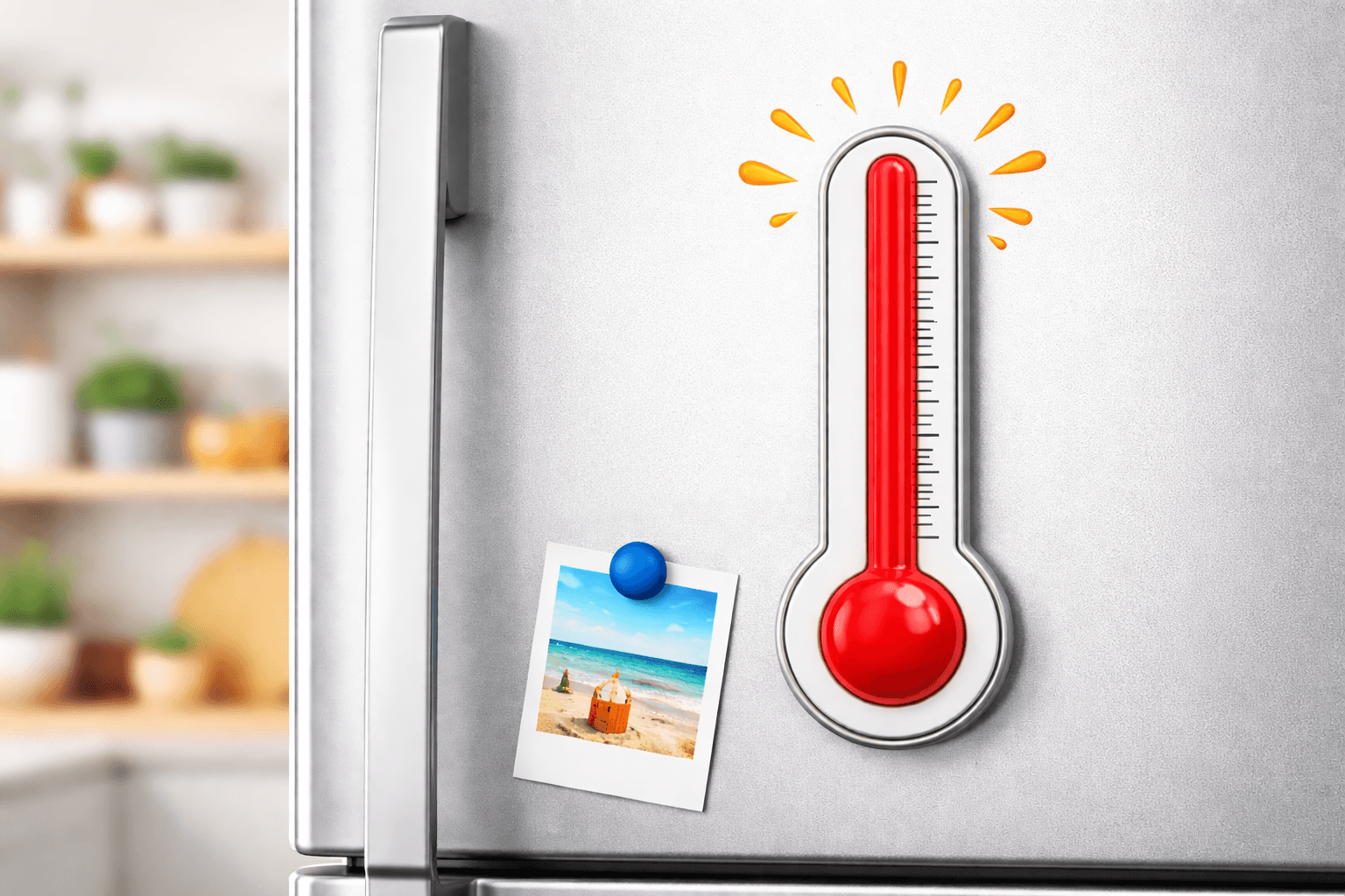
As I’m writing this, Victoria is in the middle of an intense heatwave. Two out of the last three days have pushed past 40°C, with major bushfire warnings stretching across regional Victoria.
Australia has always lived at the extremes of weather. I still remember 10 year old me lining up outside SushiSushi in Chadstone Shopping Centre (a nod to a past article) and staring up at a depressing ‘waterless’ water fountain. Even worse is the memory of being dragged out of a shower by my dad as the timer ticked past 120 seconds. From those memories to recent floods that arrive suddenly and devastate towns to many occasions of bushfires that redefine entire summers. Checking the weather in this country goes beyond seeing if it’s a beach-day or not. For many in regional parts of Australia, it can be vital to their livelihoods, or even their well-being.
You may have heard about the recent redesign of the Bureau of Meteorology website. It copped a lot of backlash in late 2025. Which got my UX brain swirling. What happens when design decisions intersect with risk, habit, and real-world consequences.
The BoM
10 years prior to the new website’s launch, In 2015, the Bureau experienced a serious cyber security breach, exposing weaknesses in its systems. Realising its instability, the organisation had no choice but to update its ageing technology and increasing technical debt. As time passed more decisions were made to not only update the backend (the workings of the site) but also take the opportunity to update the front end (the public-facing look and feel).
The previous website had not changed for over a decade. Since then design patterns had shifted, devices had changed, accessibility expectations had risen, and the existing site was no longer aligned with modern standards. External consultancies were engaged to help deliver the work. That means cost, and complexity were introduced typical of large government digital projects.
The new site launched on 22 of October 2025, but it went live just as powerful storm fronts and damaging winds were sweeping large parts of Queensland.
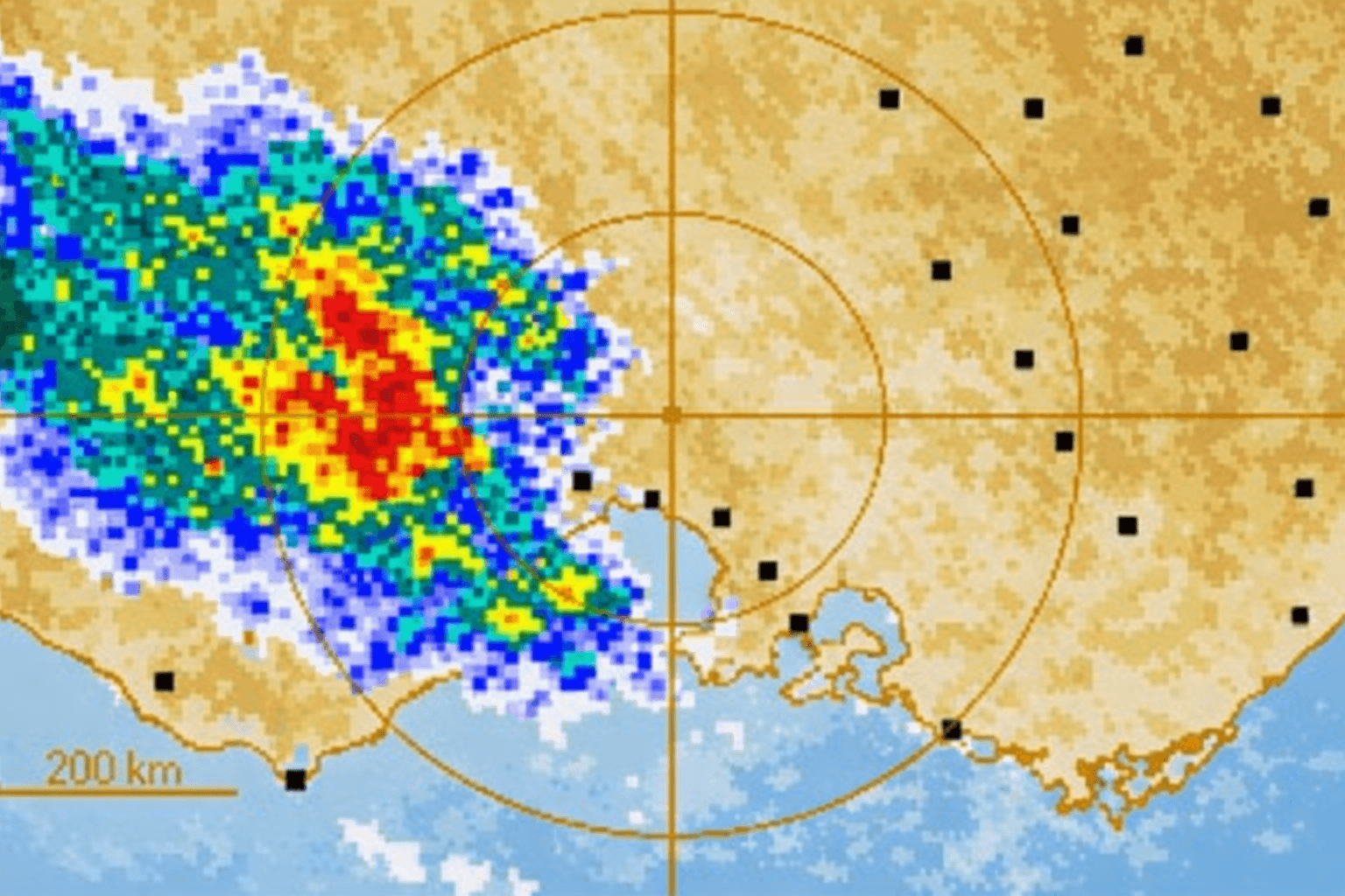
As Queenslanders turned to the Bureau of Meteorology website to monitor conditions, criticism quickly focused on the redesigned radar visualisation. Long-time users complained that the new radar made storms appear less intense than they actually were, flattening visual contrast and making it harder to distinguish between light rain and severe systems at a glance. This wasn’t just a cosmetic issue. It disrupted the learned skill of interpreting weather related risk rapidly under pressure.
Here is a summary of some of the changes:
Radar colour system and visual contrast were altered, changing how intensity and severity were signalled. Long-time users reported that familiar colour cues they relied on to quickly distinguish light rain from severe storm cells were muted.
Radar and map interactions were reworked, with new zooming, layering, and visual treatments that differed from previous behaviour.
Key information pages were moved deeper into the navigation, requiring additional clicks to access detailed observations, rainfall data, and localised forecasts.
Navigation was reorganised around broader categories, aiming to simplify discovery for casual users but breaking bookmarked paths and habitual routes relied on by farmers, regional users, and weather-savvy audiences.
How bad is bad design?
This scenario reminded me of one of the first UX books I read, User Friendly by Robert Fabricant. Early on in the book, Fabricant recounts the Three Mile Island nuclear incident where a partial reactor meltdown occurred in Pennsylvania, 1979. Thousands of nearby residents were subsequently exposed to radiation, becoming the most significant nuclear accident in US history. This failure wasn't caused by a lack of data, or by operator negligence, but by interface design. Control room dashboards displayed contradictory signals, alarms lacked hierarchy, and critical information was buried in noise. Operators technically had all the information they needed, but under pressure, they couldn’t interpret it correctly or quickly enough.
Research from the Nielsen Norman Group shows that people behave very differently under pressure than they do in calm contexts. When time is limited and stakes are high, users don’t evaluate options, they rely on recognition. This is where principles like Hick’s Law come into play. Hick’s Law states that the more choices, uncertainty, or visual ambiguity introduced, the longer it takes or harder it is to make a decision.
During the severe weather in Queensland, the residents were relying on pattern recognition built up over years of use in order to react to potentially life threatening information. Luckily enough, for Queenslanders, the storms blew over and minimal damage was done this time. However, lessons from this close-call were definitely learnt.

How should designs evolve?
Design can’t stand still but the tension lies in how that change happens for users. Over years of repeated use, layouts become mental shortcuts, colours become signals and navigation paths turn into muscle memory.
UX theory offers some guidance here on ways to reduce friction caused by change:
Testing with the right users:
User testing is only as useful as the users and conditions it represents. Reporting by The Saturday Paper revealed that internal satisfaction scores dropped sharply once a broader, more representative group of users began interacting with the site ahead of launch (falling from around 74% to just over 52%). According to the article, this was below the threshold at which the launch should have been postponed. The signal wasn’t that the site was untested, but that it didn’t hold up once real users, with real habits and real stakes, arrived at scale.
Incremental rollout:
Incremental rollout refers to introducing changes gradually rather than all at once, giving users time to adapt and teams time to learn from real-world behaviour. Its value lies in reducing shock and spreading learning over time. But it only reduces risk when changes are perceived as gradual. A single public “switch-over” moment, even after extensive internal testing, still feels abrupt to users encountering it for the first time during a high-stakes event.
Progressive disclosure:
Progressive disclosure is the idea of showing users only what they need at first, while allowing more detailed or advanced information to be revealed when required. In theory, it helps reduce cognitive load and makes complex systems feel simpler. In practice, it works only if advanced users can still access familiar, high-signal views without friction. If critical detail feels hidden or visually muted, the experience no longer feels progressive.

Who should we design for?
Some of the strongest criticism of the redesign centred on what users perceived as over-simplification, particularly in the radar and detailed weather views.
At the heart of the backlash sits a familiar question in UX: who is this actually for? In the case of the Bureau of Meteorology, the audience is incredibly broad. I know there are plenty of readers who are still confused about what the hell a Sheep Grazier Warning is (it's not sheep on the beach unfortunately) when they are just trying to decide whether to wear a puffer jacket to the MCG during footy season. On one end, there’s the metropolitan user in Melbourne glancing at the weather. On the other, there are farmers, fishers, emergency services, and regional communities using the site as a decision-making tool.
These users don’t just differ in frequency of use; they differ in mode of use. Power users rely on dense information, fast pattern recognition, and deeply ingrained workflows built up over years. Meanwhile, casual users benefit from clarity, plain language, and simplified paths.The challenge isn’t choosing one group. The challenge is supporting both.

And now… the cost
Much of the backlash has also centred around the cost of the BoM’s new website. When the redesign was first discussed publicly, the cost was framed as relatively modest. Early statements put the website component at around $4.1 million, positioned as part of a broader technology uplift rather than a large standalone project. As infrastructure modernisation widened in scope the total cost associated with the website and supporting systems grew to approximately $96 million. Which was later revealed by the incoming CEO. This figure, together with the dodgy rollout drew major criticisms of the organisation.
So what can we learn?
After intense backlash, the BoM’s has since rectified many of it’s websites shortcomings by reverting back to old patterns recognised by its passionate power users. But there is still a lesson to be learned.
The BoM’s website redesign shows just how critical good design and considered delivery are especially when systems are used under pressure. When information needs to be read at a glance, or interpreted in stressful situations, familiar signals and learned patterns aren’t just conveniences but they’re safeguards.
The challenge isn’t choosing between what already works and the need to evolve. It’s knowing how to build on existing heuristics (what people believe to be true) while carefully introducing change.
References & Further Reading:
The Briefing, Lives at risk from the BOM website disaster + Shock inflation surge. Link
ABC News Daily, Is the $96m BOM website really that bad? Link
ABC News. Backlash over Bureau of Meteorology’s ‘confusing’ new website. Link
ABC News. Bureau of Meteorology ordered to fix new website after torrent of complaints. Link
ABC News. Documents reveal the true cost of Bureau of Meteorology’s new website could be significantly higher than first thought. Link
ABC News. Bureau of Meteorology makes major changes to $96.5m website after refresh backlash. Link
The Saturday Paper. ‘Practically unusable’: Inside the BoM’s website shambles. Link
The Guardian. ‘Your new website sucks’: Bureau of Meteorology redesign is lightning rod for heated criticism. Link
ABC News. Bureau of Meteorology hacked by foreign spies in massive cyber attack. Link
Nielsen Norman Group. Minimize Cognitive Load to Maximize Usability. Link
Nielsen Norman Group. Mental Models and User Experience Design. Link
Nielsen Norman Group. Information Scent: How Users Decide Where to Go Next. Link
Nielsen Norman Group. Memory Recognition and Recall in User Interfaces. Link
Nielsen Norman Group. Hick’s Law: Designing Long Menu Lists (Video). Link
Kuang, Cliff & Fabricant, Robert. User Friendly: How the Hidden Rules of Design Are Changing the Way We Live, Work & Play. Link